

Copy these five things first: a phone-first header CTA, a clear services list, visible trust signals (registration, insurance, reviews), a quote or booking form above the fold, and a real photo gallery of completed jobs. Sites built around those five elements consistently convert better than ones stacked with generic stock photography.
Here's your immediate checklist:
- Put your phone number in the header, tappable, on every page.
- List services as their own pages, not one paragraph on a homepage.
- Show certifications, insurance, and reviews within the first screen.
- Add a short quote form that asks for postcode and job type, nothing more.
- Publish 8 to 12 real job photos, ideally organised by service type.
FlashCrafter's analysis of 50+ high-converting electrician sites found four repeatable patterns tied to steady lead flow, and a platform like TradeWise can turn that quote form into a job the moment it lands.
Key Takeaways
The electrician sites that generate the most calls share five features: phone-first CTAs, real project photography, visible trust badges, service-specific pages, and a short quote form synced to daily job scheduling.
| Point | Details |
|---|---|
| Lead with the phone number | Make it tappable and visible in the header on every page, not just contact. |
| Show real work, not stock photos | Organise 8 to 12 job photos by service type to build immediate trust. |
| Surface trust signals early | Registration, insurance, and reviews belong above the fold, not buried in About. |
| Build service-specific pages | A dedicated EV charger or rewire page converts better than one generic services paragraph. |
| Connect the site to daily operations | Platforms like TradeWise sync quote forms directly into job scheduling and invoicing. |
Table of Contents
- Electrician website examples worth studying
- Design patterns that turn visitors into calls
- Choosing between a template, a builder, or a designer
- Where to find templates, themes and trade website builders
- Customising a template so it doesn't look like a template
- A website that also runs your jobs
- Frequently asked questions
- Sources
Electrician website examples worth studying
Eight sites below show what these patterns look like when someone actually builds them. Screenshot each one yourself before you start your own redesign, since the layout details matter more than the description.
1. A one-page trade specialist site. Apex PAT Testing's site strips everything back to a single clear service, contact block, and short explainer copy. What to copy: the restraint. If you offer one core service, resist the urge to pad the homepage with filler sections.
2. A project-led construction and electrical hybrid. West360 Construction leads with finished-job photography rather than stock imagery. What to copy: organise your gallery by project type (rewires, consumer units, EV chargers) rather than one undifferentiated photo dump.
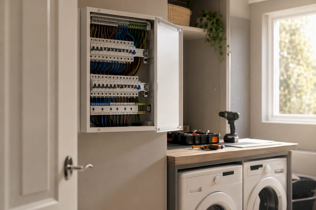
3. A technical product-and-service blend. ALA Appliances shows how to present product specifications alongside a booking call-to-action without the page feeling cluttered. What to copy: use short spec tables next to service descriptions when your work involves named equipment or brands.
4. Agency-built hero layouts. Webfactory's electrician portfolio demonstrates bespoke hero sections with bold typography and a single dominant CTA button. What to copy: one headline, one CTA, no competing buttons above the fold.
5. Emergency-first layouts. Sites built around 24/7 call-out work tend to push a red or high-contrast "Call Now" button above everything else, often paired with a response-time promise. What to copy: state your response window explicitly ("out within 60 minutes") rather than a vague "fast service" claim.
6. Safety and compliance-led layouts. Some electrician sites foreground NICEIC or NAPIT registration badges directly under the header. What to copy: badge placement above the fold, not buried in an "About" page.
7. Smart-home and EV specialist sites. These lean on clean, modern grid layouts with icon-led service breakdowns for EV chargers, smart lighting, and home automation. What to copy: icon-plus-short-text service cards scan faster than paragraphs on mobile.
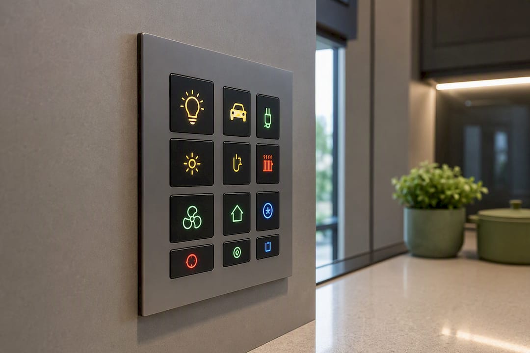
8. Commercial B2B electrical contractor sites. These favour a subdued palette, case studies, and a "Request a Callback" form instead of a consumer-style booking widget. What to copy: swap consumer CTAs for a lead-qualification form when your clients are facilities managers, not homeowners.
Pro Tip: Screenshot competitors' sites on your phone, not your laptop. A majority of trade searches happen on mobile, and a hero section that looks sharp on a widescreen monitor often breaks completely on a 6-inch screen.
Build your own image grid from these eight examples before you brief a designer. Seeing them side by side makes it obvious which layout style fits your trade.
Design patterns that turn visitors into calls
Certain patterns show up again and again across the 35+ examples SiteBuilderReport catalogues, and they're worth treating as a checklist rather than inspiration to admire from a distance.
- Phone-first header. Number visible and clickable on every single page, not just the contact page.
- Service-specific landing pages. A dedicated page for "EV charger installation" ranks and converts better than a single paragraph inside "Our Services."
- Visible pricing or financing signal. Even a rough guide ("most rewires from £X") reduces the number of time-wasting enquiries.
- Photo gallery of real jobs. Stock photography of a stranger in a hard hat convinces nobody.
- Trust badges near the top. Registration numbers, insurance, and review scores, ideally within the first scroll.
- Fast mobile load and large tap targets. A slow site loses trades leads faster than almost any other business type, because people calling an electrician are often mid-emergency.
Three things you can do this week on a limited budget: compress your hero image so the page loads under two seconds, add a one-line financing or "no call-out fee" statement near your CTA, and rewrite your homepage's first sentence to name your service area explicitly.
For local search, add a short FAQ section answering the questions people actually type ("how much does a consumer unit upgrade cost", "do you offer emergency call-outs"), and list your service areas by name rather than a vague "we cover the local area."
Choosing between a template, a builder, or a designer
Speed, budget, and how much custom branding you need should drive this decision, not which option sounds most professional.
- Choose a template if you need a live site within a week and your branding is simple (one core colour, a logo, straightforward services).
- Choose a hosted trade builder if you want the site to plug directly into quoting, scheduling, or job management without stitching tools together.
- Choose a designer or agency if you need bespoke branding, multiple service divisions, or heavy local SEO work across several towns.
Before hiring anyone, ask: What's the turnaround time? Can I see mobile screenshots of three live sites you've built? Do I get CMS access and ownership of the site afterwards? How does the quote form integrate with my existing tools?
Walk away if an agency can't show mobile screenshots, gives vague day-rate pricing instead of a fixed quote, or buries the contact details three clicks deep on their own site. If they can't market themselves properly, they won't market you properly either.
Where to find templates, themes and trade website builders
Three practical routes exist, each with a real trade-off.
- Theme marketplaces and page-builder kits (Wix's electrician template collection, for instance) give you fast customisation but limited depth for job management features.
- Agency portfolios show bespoke, higher-cost builds with stronger branding control, at the price of longer turnaround.
- Dedicated trade website builders trade some design flexibility for built-in booking, quoting, and job-sync features out of the box.
If you're already juggling admin, a trade-focused builder that connects your site to your actual job list saves the step of manually copying enquiries into a separate system.
How the examples were selected
Sites were picked for visual clarity, a genuine above-the-fold CTA, visible trust signals, real project photography rather than stock imagery, and solid mobile-first layout. Examples came from live portfolios, template libraries, and public electrician sites, pulled recently to reflect current design norms rather than dated 2020-era layouts.
Customising a template so it doesn't look like a template
The fastest way to spot a template site is identical stock photography and generic copy. Swap every stock image for real job photos within the first week of launch. Even phone photos of finished consumer units or clean cable runs beat polished stock shots of an actor in a hi-vis vest.
Rewrite the homepage headline to name your actual specialism and location rather than the template's placeholder text ("Trusted Local Electricians" becomes "EV Charger and Rewire Specialists Covering [Your Town]"). Match your brand colour to your van livery and workwear so the site feels like the same business a customer sees pull up outside their house.
Add a short "About" section with your qualifications, years trading, and registration body, since generic template bios read as hollow to anyone comparing three electricians at once. Replace the template's generic testimonial placeholders with your own Google reviews, pulled directly rather than paraphrased.
Finally, adjust the services list to match exactly what you do. A template built for a general contractor will list services you don't offer and miss ones you do, and that mismatch costs you enquiries from people who assume you don't cover their job.
A trades-industry take on where to start
Most electricians redesign the whole site at once and burn weeks on decisions that don't move the needle. Start narrower: fix the phone CTA and add real job photos first, since trust signals like registration status matter more to a nervous homeowner than a clever layout.
Pro Tip: Wire your quote form to sync straight into your job list. A form that just emails you creates the same manual re-entry problem as a paper pad on the dashboard of your van.
A website that also runs your jobs
Templates and agency builds get you a homepage. They don't get you a system that turns a quote request into a scheduled job without you retyping it somewhere else. That's the gap TradeWise fills: it hosts your site and syncs bookings, quotes, and job scheduling into one mobile-first dashboard, so an enquiry submitted at 11pm becomes a job on tomorrow's schedule without manual entry.
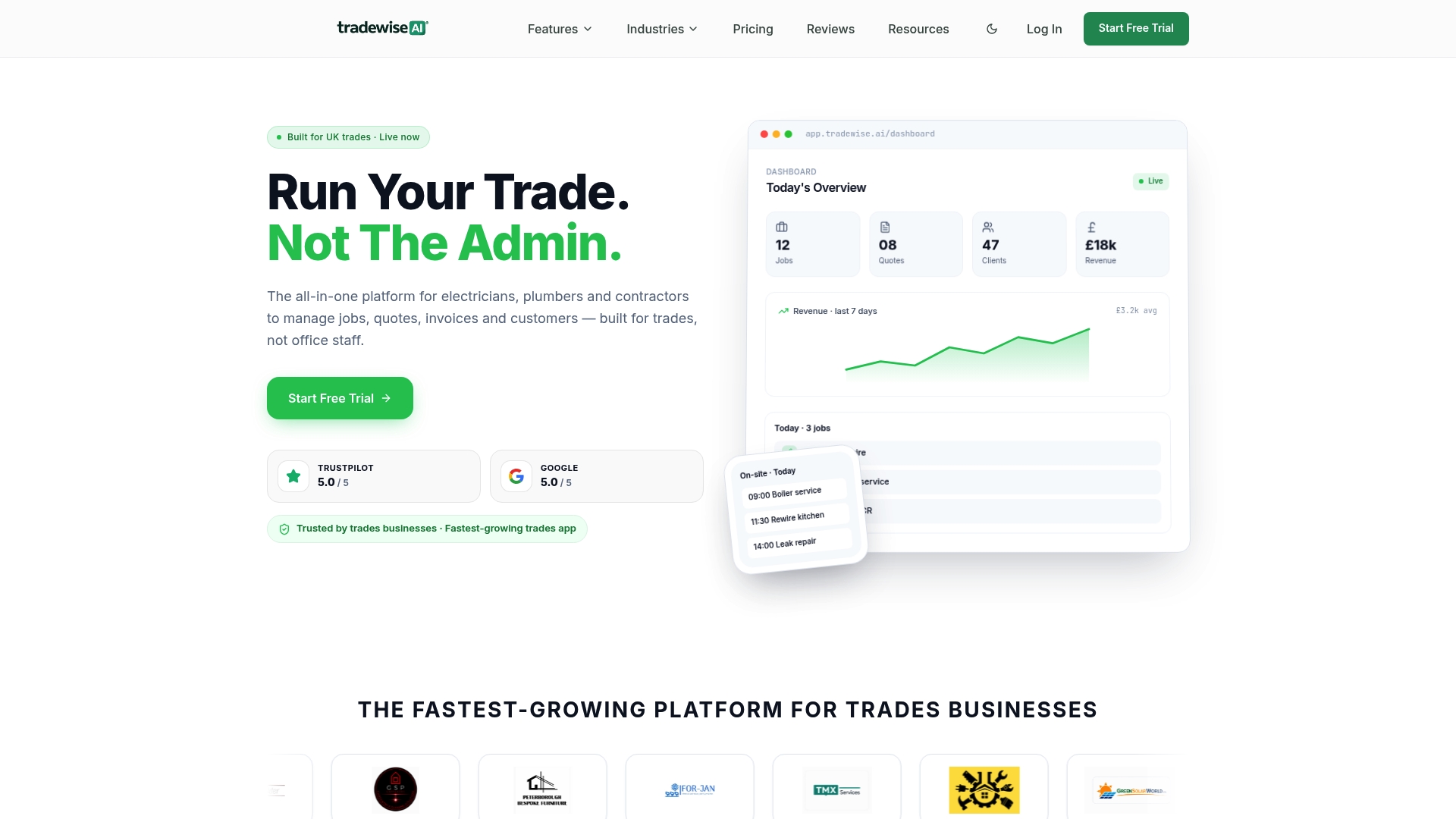
This matters most once you're past the one-person, one-van stage. If you're fielding several online enquiries a week, managing a small team, or drowning in admin between jobs, an integrated platform saves more time than a beautifully designed but disconnected site ever will. TradeWise's platform handles quoting, invoicing, and staff scheduling alongside the website itself, so leads don't sit in an inbox waiting for someone to act on them.
If that sounds closer to what your business actually needs, TradeWise offers a 14-day free trial to see how the site and job management work together before committing to anything.
Frequently asked questions
What makes a good electrician website example? A strong example combines a phone-first CTA, real job photography, visible trust badges, and a short quote form, all loading fast on mobile.
Should I use a template or hire a designer? Use a template if you need a live site fast and your branding is simple. Hire a designer for bespoke branding or multi-service, multi-area businesses.
What's the fastest way to launch a professional electrician site? A trade-focused website builder or theme marketplace like Wix gets you live quickest, especially if it integrates with your existing quoting and scheduling tools.
How many photos should an electrician website gallery include? Eight to twelve real job photos, organised by service type, gives visitors enough proof without overwhelming the page.
Do electrician websites need online booking? Not strictly, but a short quote or booking form significantly reduces missed enquiries compared with a phone-only contact page.
Sources
- Electrician Website Examples | 10+ Real Designs | FlashCrafter
- Electrician Websites: 35+ Inspiring Examples (2026)
- Electrician Website Design Examples - Webfactory
- Electrician Website Templates